
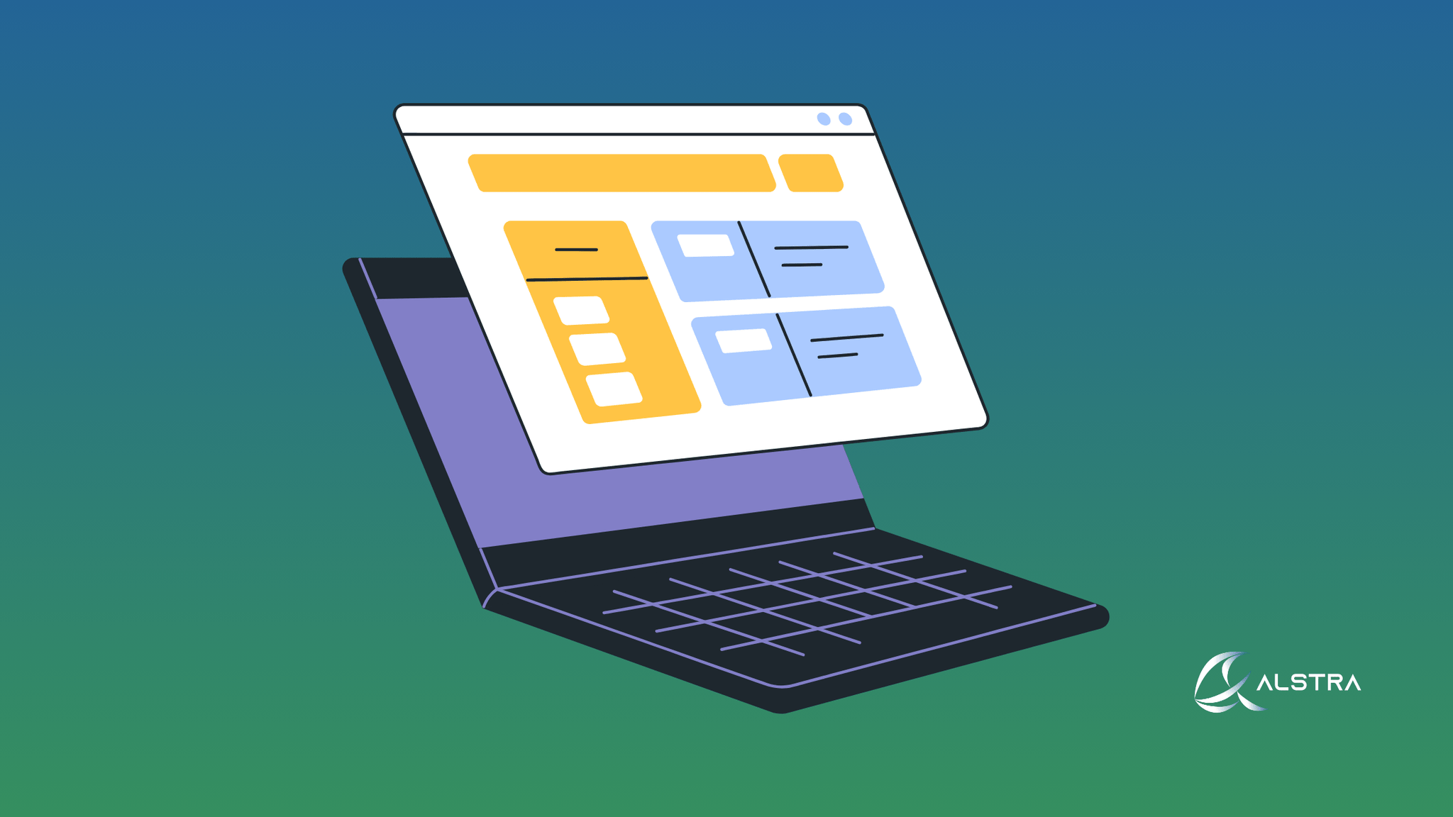
When Canadian businesses build their online presence, they have to make a big choice: should they use adaptive or responsive web design? This choice has a direct effect on how well the website works, how users feel about it, and, in the end, how well the business does. Knowing the technical differences between these methods can help you choose the one that best meets the needs of your business and its audience.
Getting to Know the Two Design Methods
Adaptive design works by making several fixed layout versions of your website. The server detects what kind of device the user is using when they visit your site, whether it's a desktop, tablet, or mobile phone. It then serves them a specific, pre-made template that fits that screen size. This method often means writing separate HTML and CSS code for each type of device.
Responsive design, on the other hand, uses a single, flexible layout that changes smoothly to fit any screen size. This method uses CSS media queries, flexible grids, and scalable images to make sure that your website looks and works the same on all devices with one codebase.
What this means for your business's performance
Benefits of Adaptive Design for Performance
The main benefit of adaptive design is that it speeds things up. Because your server only sends assets that are made for the user's device, it doesn't load extra resources, which makes the initial load times faster. This targeted approach can make the user experience much better, especially for mobile users who might be on slower connections.
According to research, adaptive designs can make better use of device-specific optimization and caching benefits. Each template can be fine-tuned for the device it will be used on, which could improve performance metrics and search engine rankings. These are very important for Canadian businesses that want to do well in the digital marketplace.
Adaptive design, on the other hand, needs advanced device detection systems, which make your website's architecture more complicated. This lets you optimize things very precisely, but it also means that new types of devices or screens that are not standard sizes may not look their best unless you make more templates.
Things to think about when it comes to responsive design performance
With its universal codebase approach, responsive design gives you more flexibility than any other type of design. Your development team maintains one set of HTML, CSS, and JavaScript files that work on all devices. The elements automatically change size or position based on the size of the viewport.
The trade-off is in how resources are delivered. Responsive sites may send extra assets to smaller screens unless they are specifically optimized using techniques like responsive images with srcset attributes. Studies show that rendering and layout changes on the client side can use more device resources, which could mean longer load times on devices with less power if they aren't optimized correctly.
Things Canadian Businesses Should Think About When Making Plans
When Adaptive Design Is a Good Idea
When your business serves a well-defined group of users who use their devices in predictable ways, adaptive design is most useful. For instance, if you're making specialized business apps and you know that most of your users only use certain devices to access your platform, adaptive design lets you make those experiences as good as possible for those situations.
Adaptive design's targeted optimization features are often helpful for Canadian B2B companies that control their users' environments, like internal corporate tools or apps made for a specific industry.
When Responsive Design Is the Best Option
Responsive design is better for most Canadian businesses that serve a wide range of customers because it is more flexible and easier to keep up. Because Canada's population is so diverse and technology is always changing, responsive design automatically works with new screen sizes and devices without needing any extra work.
The single codebase approach makes maintenance a lot easier and lowers the risk of bugs appearing in more than one version. This is especially useful for small to medium-sized Canadian businesses that need to get the most out of their development resources while making sure that their apps work on a wide range of devices.
Choosing the Best Option for Your Business
It's not always a clear choice between adaptive and responsive design. Many successful Canadian businesses use a mix of approaches. They start with responsive design principles and then improve their most important resources so that their performance levels are close to those of adaptive design.
When making this choice, think about your target audience, the development resources you have available, and your ability to maintain the project over time. Most Canadian businesses will find that responsive design gives them the best mix of flexibility, cost-effectiveness, and future-proofing. However, adaptive design is better for situations where you need to get the most performance out of a specific, well-defined user group.
The most important thing is to make sure that whatever method you choose is in line with your business goals and gives your Canadian customers the best experience possible on the devices they prefer.